Redesigned IntelliTrack's fragmented RMA workflow into a guided enterprise experience by identifying critical operational friction through stakeholder research and behavioral analytics.
time
August 2025 – May 2026
role
Design Lead & Project Manager
TEAM
7 UX Designers, IntelliTrack Stakeholders
project type
Enterprise UX
Workflow Design
Information Architecture
Behavioral Analytics
AI-Assisted Workflow
context
Managing enterprise assets at scale.
IntelliTrack helps organizations manage inventory, repairs, returns, shipments, and lifecycle operations. As part of a 10-month partnership with DecisionPoint Technologies, our team was brought in to evaluate the platform and identify opportunities to improve critical operational workflows.
Through stakeholder conversations and behavioral analysis, we set out to understand how enterprise teams actually navigated the system and where friction emerged in day-to-day operations.
problem
The return management workflow lacked visibility, requiring users to navigate across multiple screens and workflow states.
Return requests are one of IntelliTrack's most critical operational workflows, involving shipments, repairs, approvals, and multiple stakeholders. As the platform evolved, information became fragmented across the system, making it difficult for users to understand request progress, track assets, and identify next steps efficiently.
Redesign at a glance
Design outcomes
4-Step
Guided RMA creation flow
5 Major
Edge cases supported
1 Centralized
Tracking experience
100%
Return lifecycle visibility
PROCESS & Research STRATEGY
Understanding the Product
Understanding User Behavior
High-Impact Workflow Identified
01 / Product grounding
Existing Information Architecture
Audited content types, admin entry points, and permission-driven paths to reveal where structure worked against decision-making.
Heuristic Evaluation
Reviewed visibility of system status, error recovery, and cognitive load across the moderation flow.
Competitor Analysis
Compared moderation tools across adjacent products to identify common patterns and where Intellitrack needed a sharper workflow.
02 / User behavior
User Research Strategy
Defined the riskiest assumptions and prioritized research around decision quality, confidence, and speed.
Adaptive Research Strategy
Adjusted prompts and sessions as new behavior patterns emerged, keeping the inquiry close to real admin work.
Stakeholder Conversations
Aligned policy, business, and support perspectives around the cost of false positives and delayed action.
Behavioral Analysis
Translated observed workarounds into interface requirements for review queues, bulk actions, and contextual evidence.
03 / Workflow opportunity
Interaction
Competitor Analysis
Reviewed leading platforms that support community-led businesses to understand how they handle operations at scale.
While these tools offered strong features in isolation, most lacked a unified system for managing operations end-to-end, leading to fragmented experiences for admins.

Key Insights
After synthesizing findings from user interviews and competitor analysis, six core insight areas emerged that guided key design decisions.
Content Management
Admins need a single place to monitor and regulate content shared by both admins and members to maintain quality and community guidelines.
Member Management
Community managers need better tools to invite members, assign roles, and track activity and engagement at scale.
Financial Administration
Businesses need clearer visibility into revenue, balances, and transactions, along with flexible filtering for smarter payment management.
Subscriptions Administration
Admins need simple ways to create flexible plans, automate billing, and send reminders to reduce manual follow-ups.
Dashboard Analytics
Decision-making requires a consolidated analytics view with filters that surface engagement trends and growth signals.
Communication
Communities need scalable direct and group messaging that supports coordination while protecting personal information.
Who Are the Users?
Used by a diverse age range, from teens to older adults, requiring the experience to be simple and accessible.
02
Members
+
03
Support Staff
+
Design Solution
Defining Core User Flows & Wireframes

Dashboard
Communities
Plans
Payment Transactions
Payment Request
Create a community
core workflows
ADMIN INTERFACE
01 — Setting Up a Community
Admins begin by setting up their business as a community, shaping how members interact and engage. This approach shifts the experience from transactional to more personal and relationship-driven.
Guides users through a structured, step-by-step setup to define and organize the information displayed for their community, including selecting an available domain within the platform
Generates a dedicated, shareable page within the system that functions as a public-facing entry point for the community.
02 — Add and Manage Members
Defined how users enter and are organized within the community by designing flows for invites, approvals, and role assignment. This created a clear structure for access and participation, reducing ambiguity as communities scaled.
Bulk invite flows, join request handling, and role-based permissions were integrated into a single system.
03 — Subscription Setup
Designed a flexible plan configuration system where pricing, duration, and access levels can be defined based on different community needs. This allowed businesses to structure access without relying on rigid, one-size-fits-all models.
Includes plan setup with variable pricing, time-based access, automated billing, and renewal reminders.
04 — Payments & Revenue
Designed a financial tracking layer that surfaces key metrics such as earnings, balances, and transaction states in a single view. Filtering capabilities were introduced to help users break down revenue across communities and time periods.
Supports real-time tracking with filters for date ranges and community-specific insights.
05 — Dashboard & Insights
Designed a centralized view to surface key metrics around growth and engagement, making it easier to monitor community performance over time. Filtering was introduced to allow users to focus on specific communities and time ranges.
Includes real-time insights with community-level and date-based filtering.
MEMBERS INTERFACE
Member's Platform Experience
A quick walkthrough of the member experience across key sections of the community.
Key Highlights:
Home feed for updates and posts from the community
Chat interface for direct communication
Payment reminders surfaced for upcoming dues
Plan selection for subscriptions and access
Member directory to view and explore participants
About section for community details
Visual Style and Branding


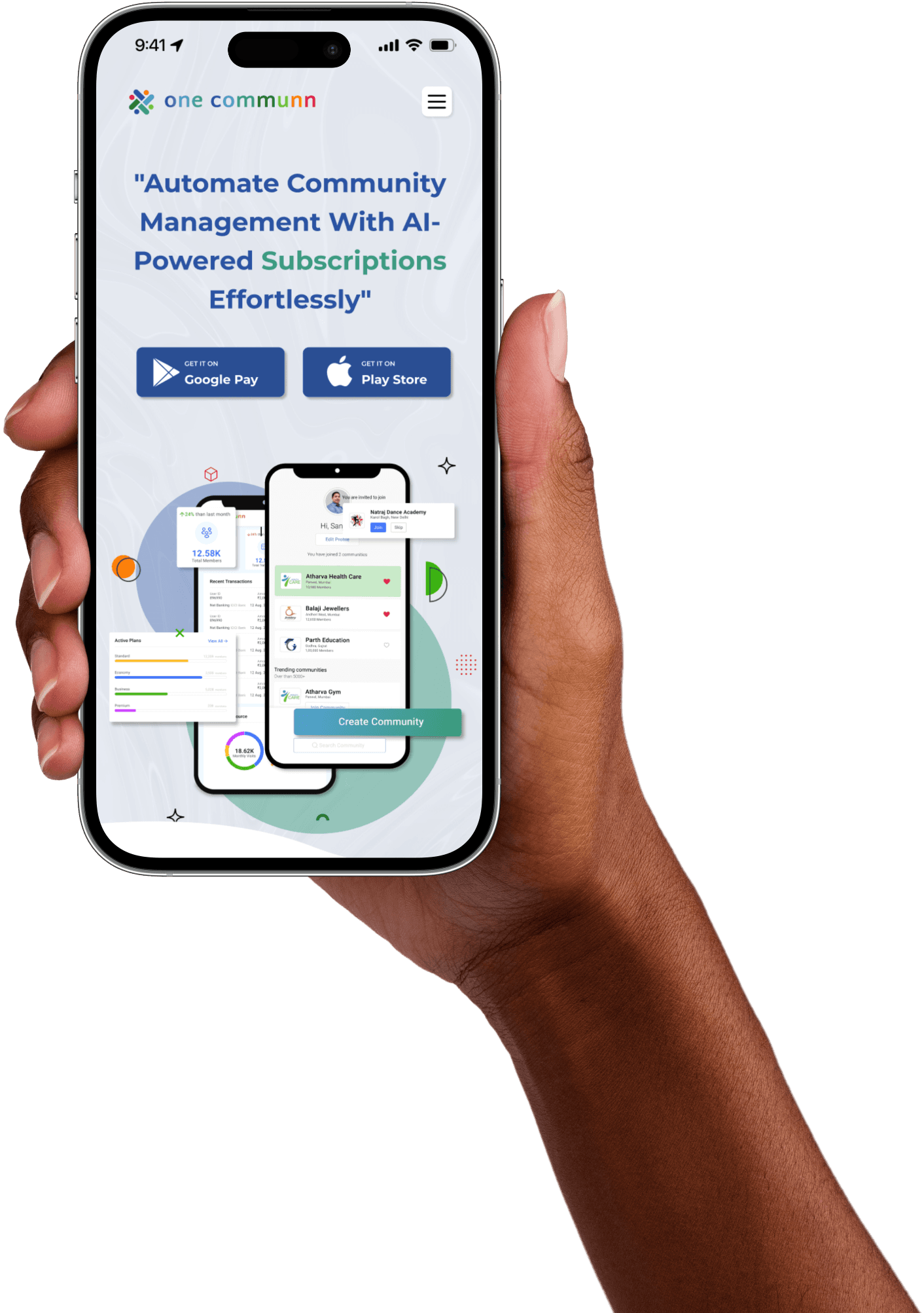
OneCommunn
OneCommunn
onecommunn.com
Created the brand identity, logo, and a cohesive visual language that defines the look and feel of the product across the platform.
Aa
Montserrat
Regular
Medium
Semibold
# 2653A3
# 4BA1CB
# 389C80
# 227727
# 7FC41B
# FE7F06
# DA0242
Landing Experience
Designed the landing page across web and mobile to clearly communicate the product, using structured sections and user story–based use cases to help different businesses understand how it fits their needs.

Roadblocks & reflection
Designing for diverse business needs meant constantly refining flows and making trade-offs.
Simplifying complex features by grounding them in real business needs
Sticking to a consistent visual style as the product evolved
Improving clarity in developer handoff and communication
In hindsight, narrowing to a few core use cases would have made the experience more focused and scalable
OTHER PROJECTS


Let’s build
something